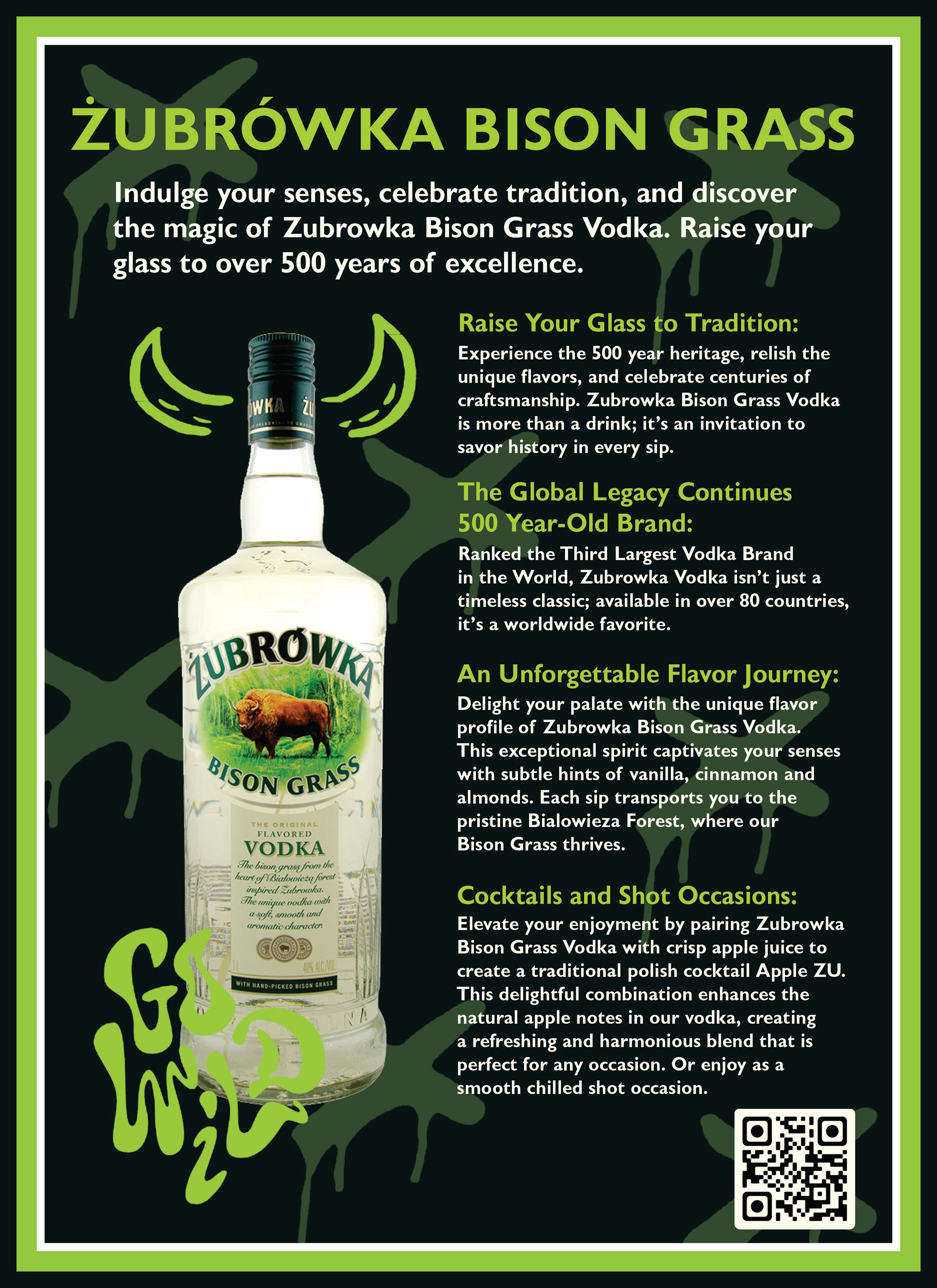
Zubrowka is the 3rd largest vodka brand in the world and they are planning to expand their audience to the United States. Their brand is already well established in their home country, Poland. My role as the design specialist for the American sales team is to utilize current branding systems and create deliverables that showcase the vodka's fine flavors and the wilderness that it unleashes (while consuming responsibly, of course.)
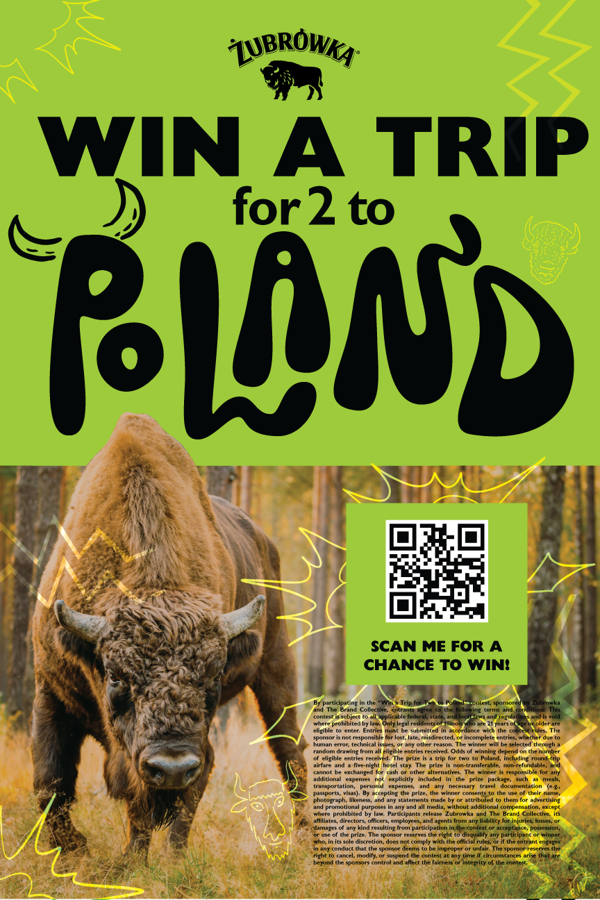
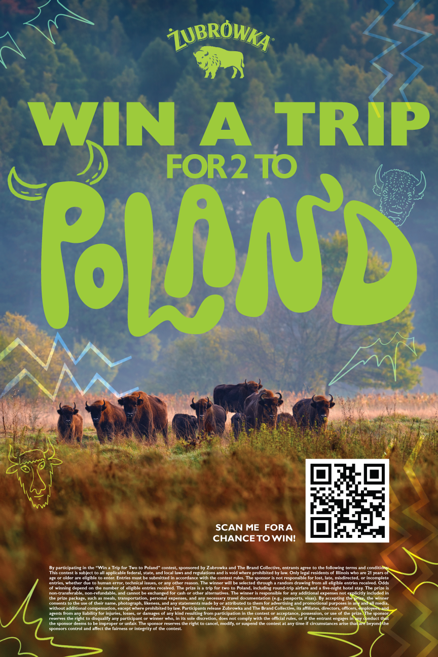
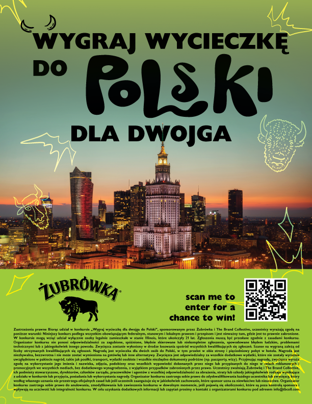
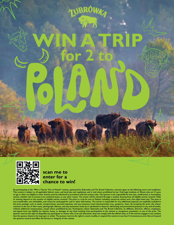
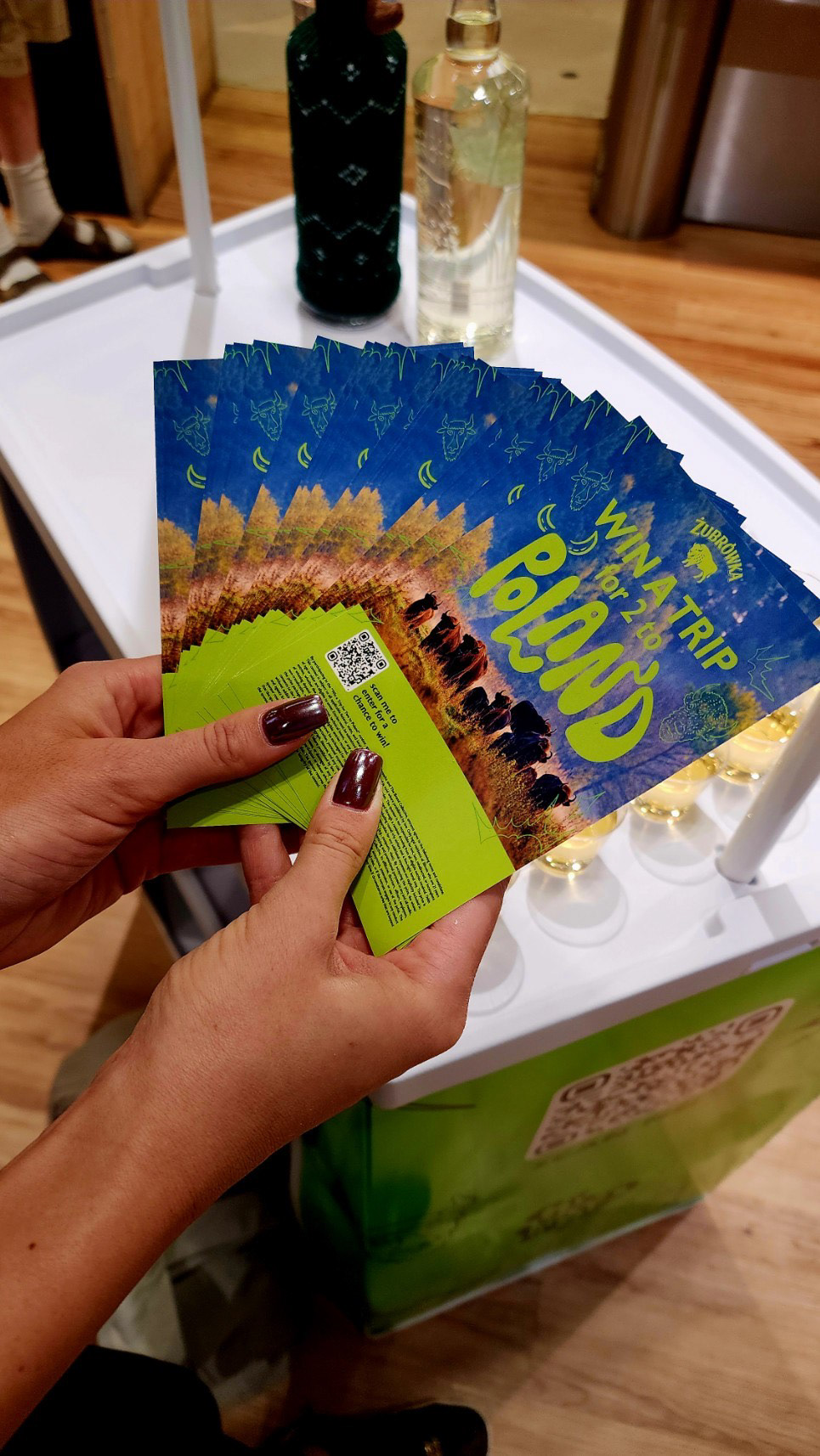
Win a Trip To Poland
The most recent work done was for a contest for a trip to Poland. For this, I created a variety of designs to help promote this event and vodka brand.
I was looking to appeal to the middle-aged audiences that would be frequenting the locations the pop-up stand would be while keeping the fun and energetic energy the brand was trying to encapsulate.
I was looking to appeal to the middle-aged audiences that would be frequenting the locations the pop-up stand would be while keeping the fun and energetic energy the brand was trying to encapsulate.
POSTERS
FLYERS
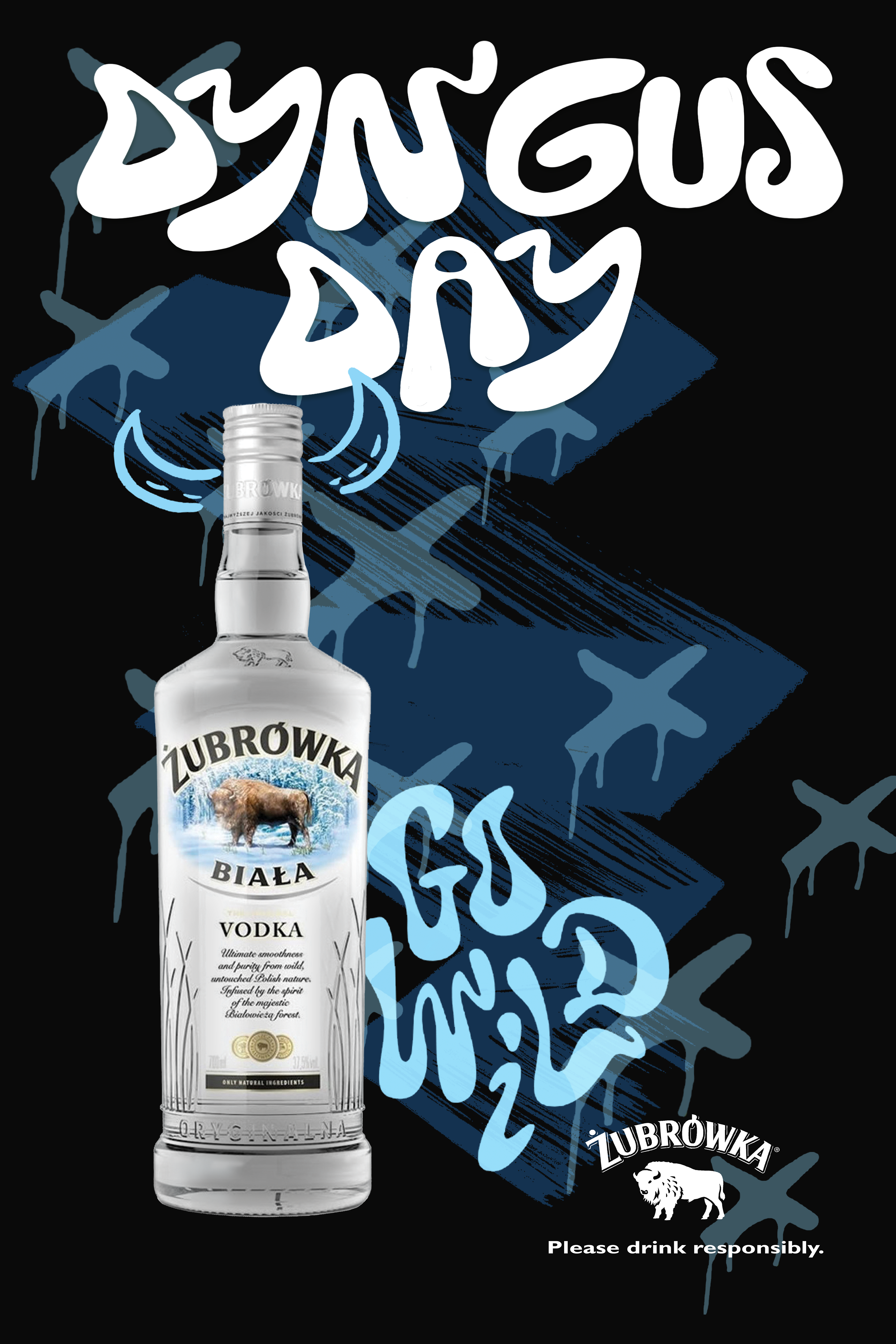
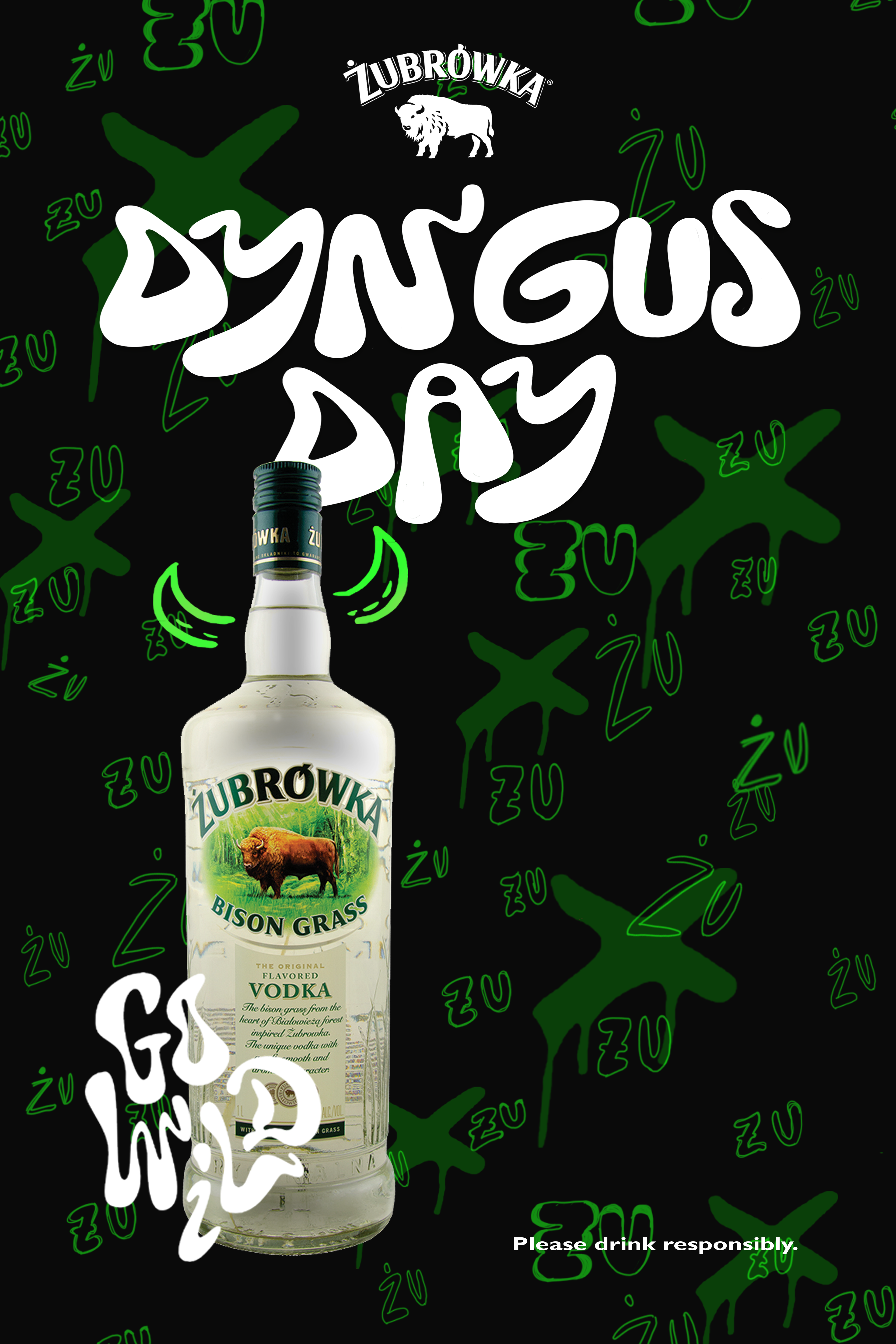
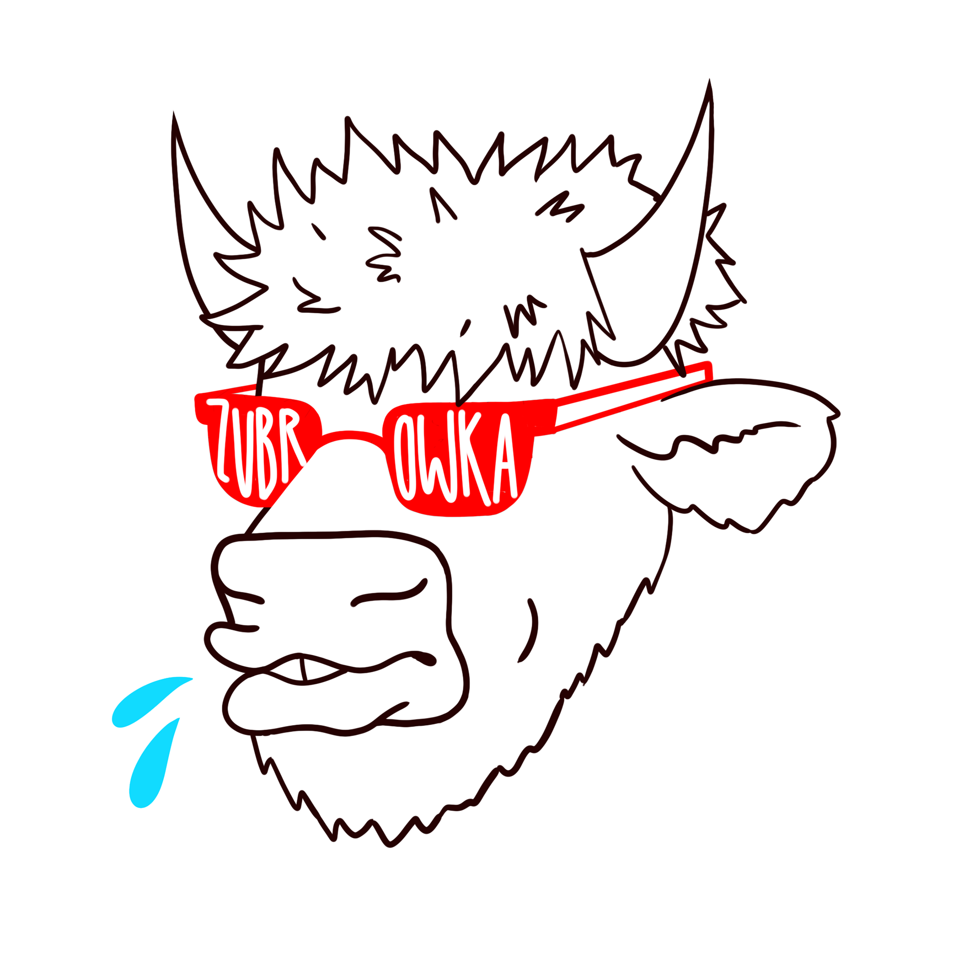
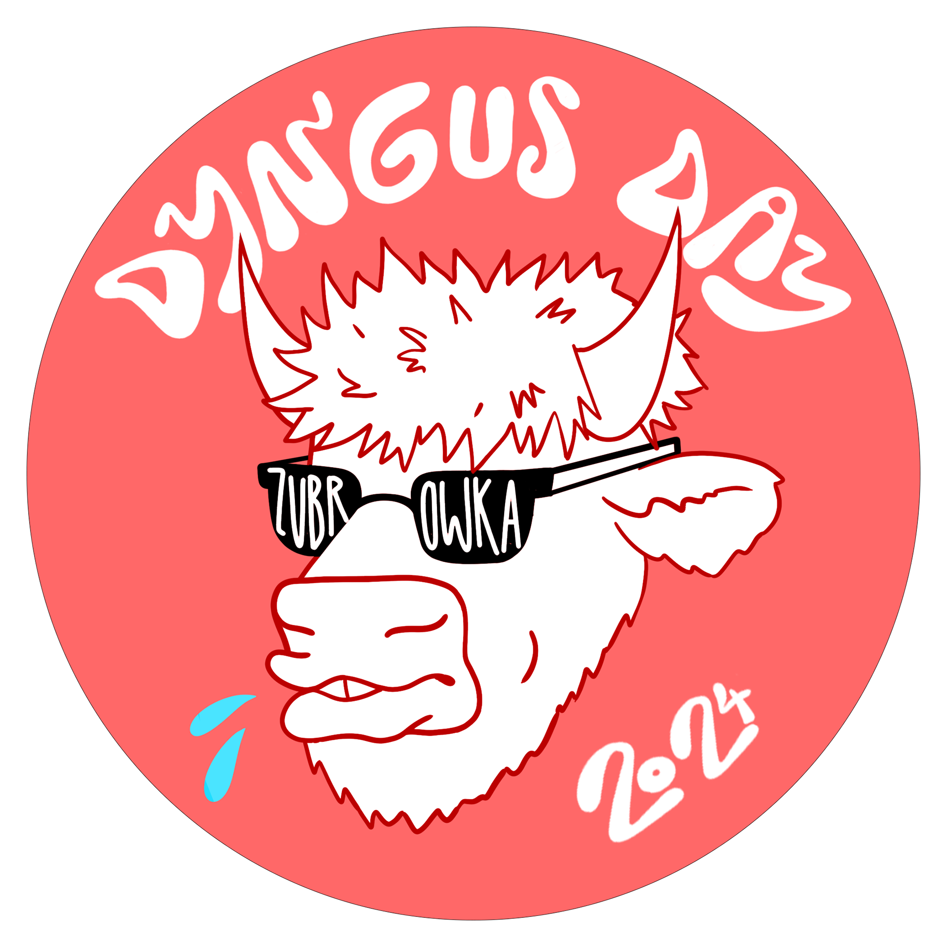
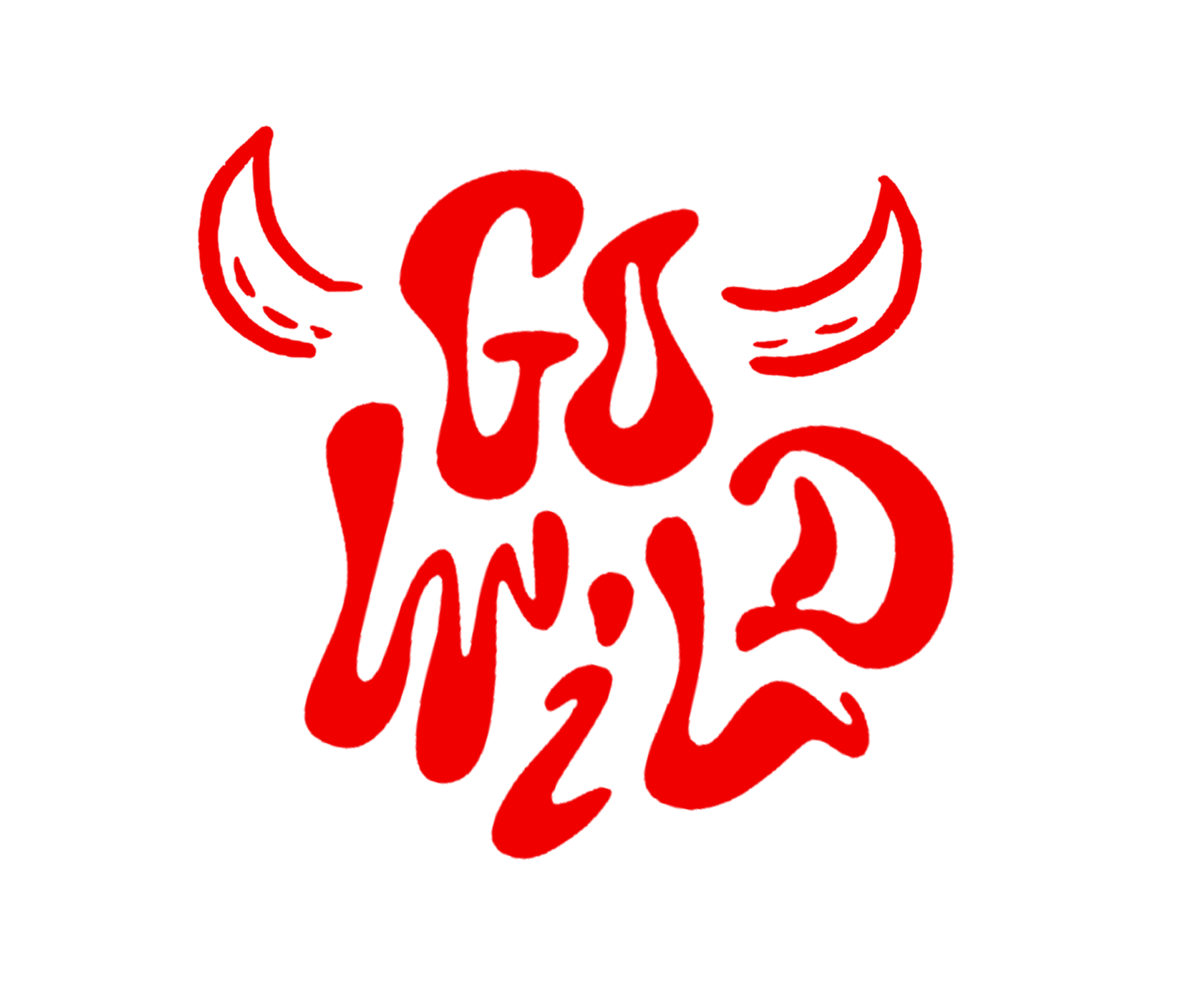
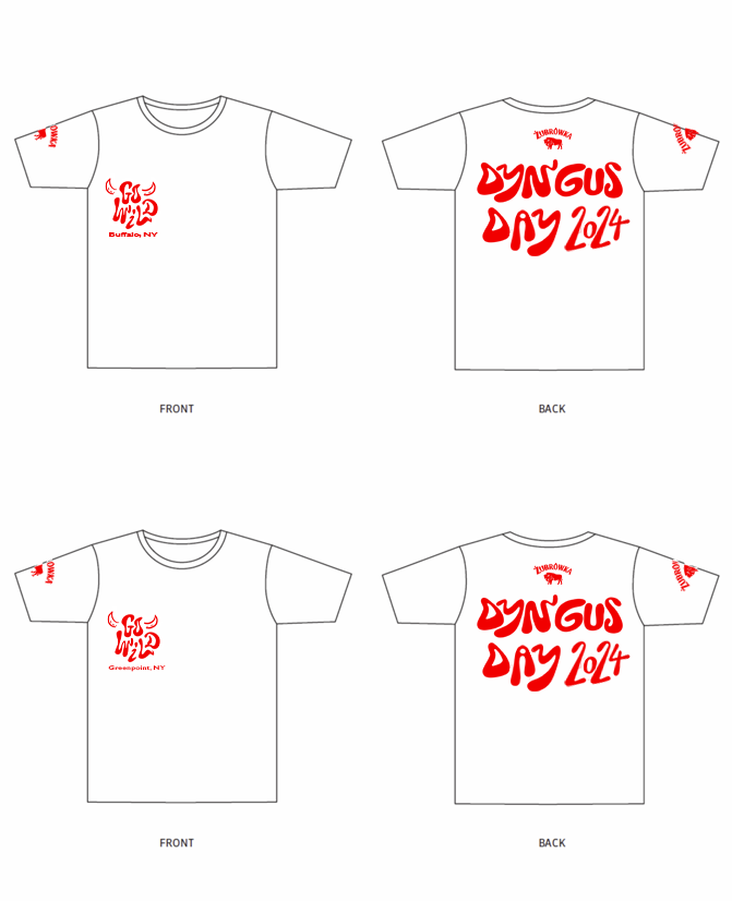
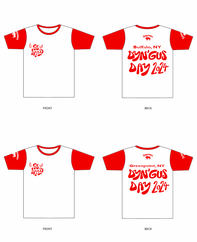
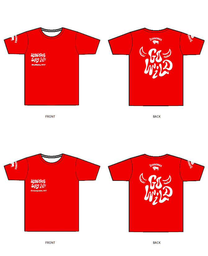
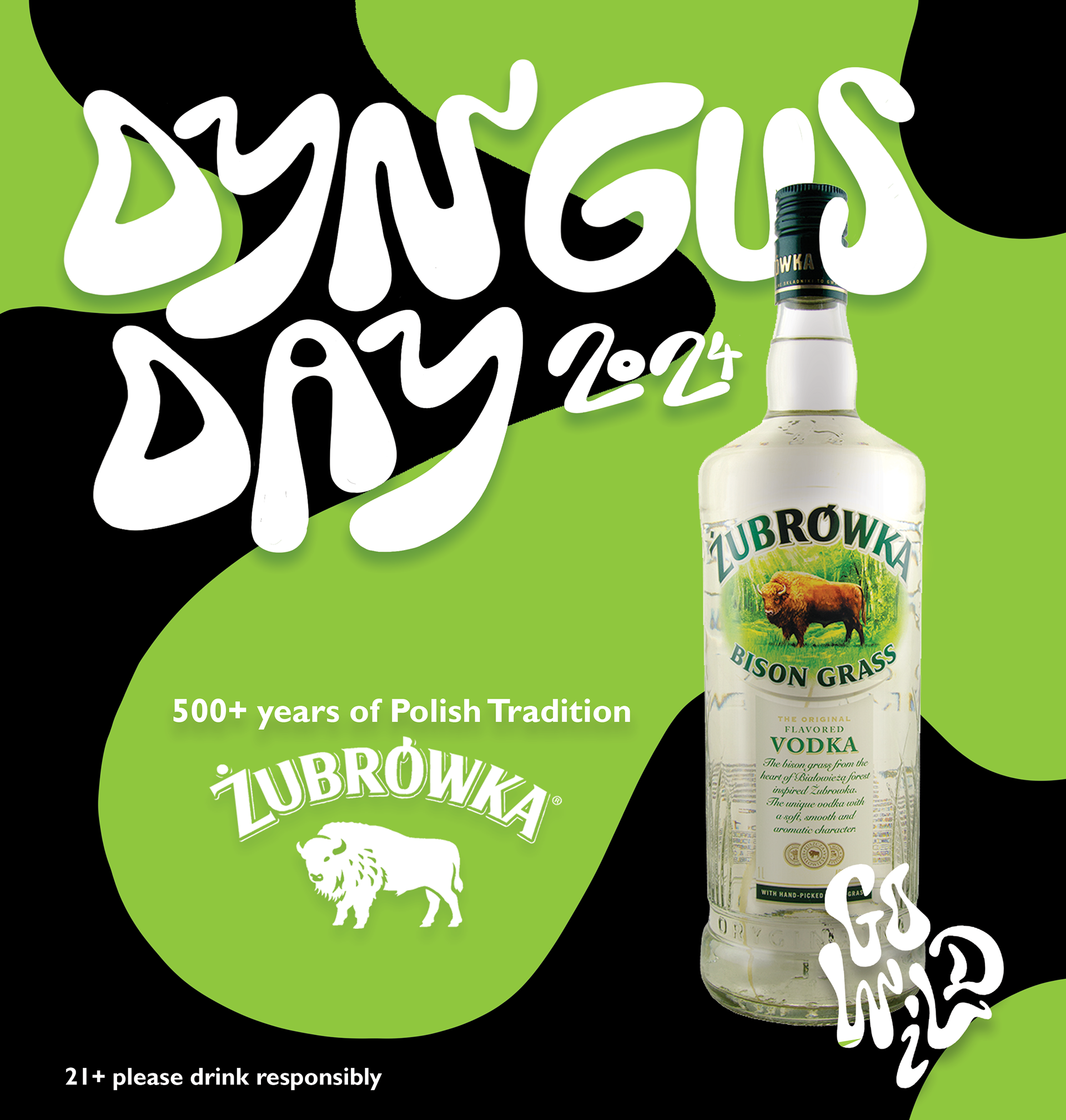
Dyngus Day
These deliverables were created for an old Polish festival, Dyngus Day.
I had a particularly great time hand lettering the title trying to match the font "go wild" is in.
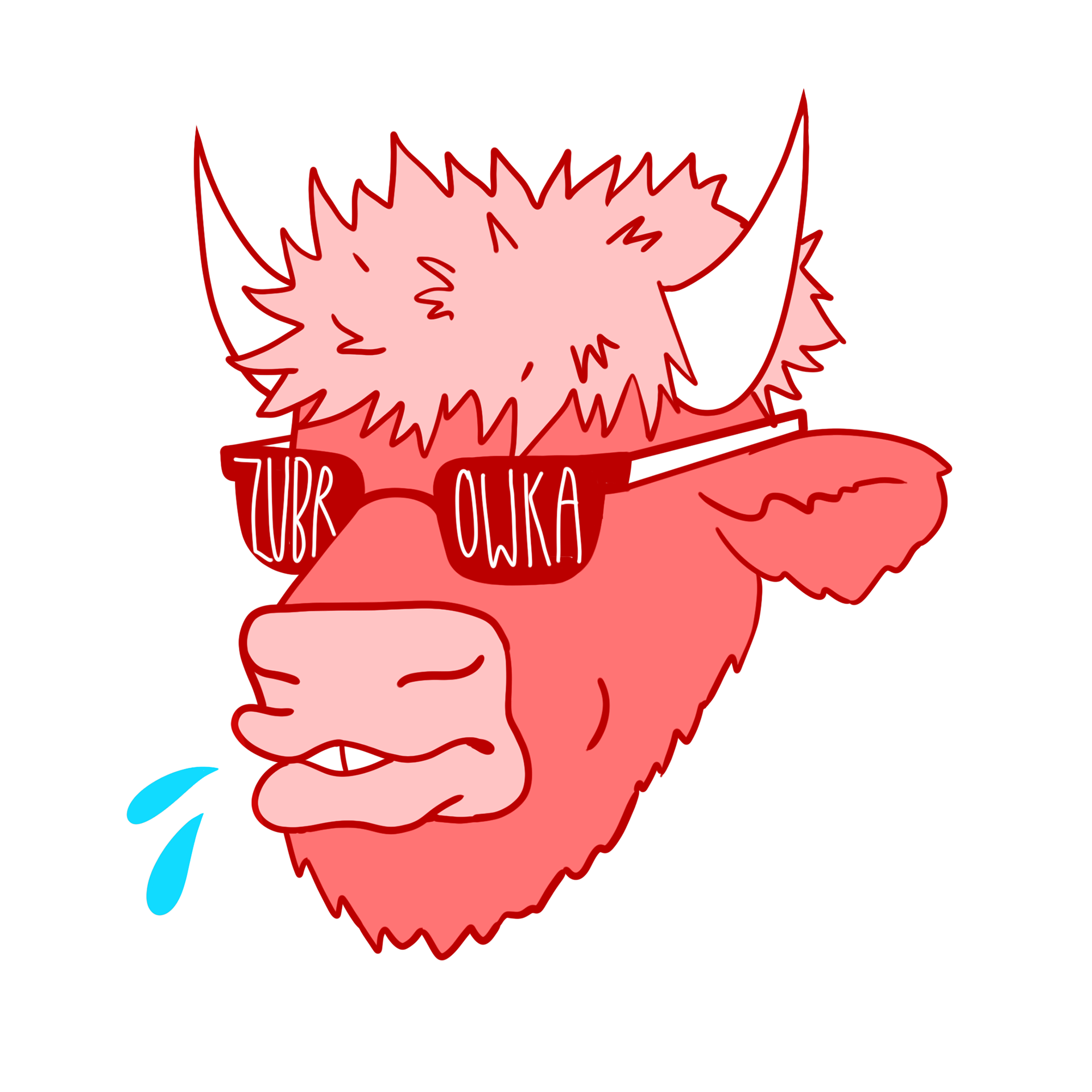
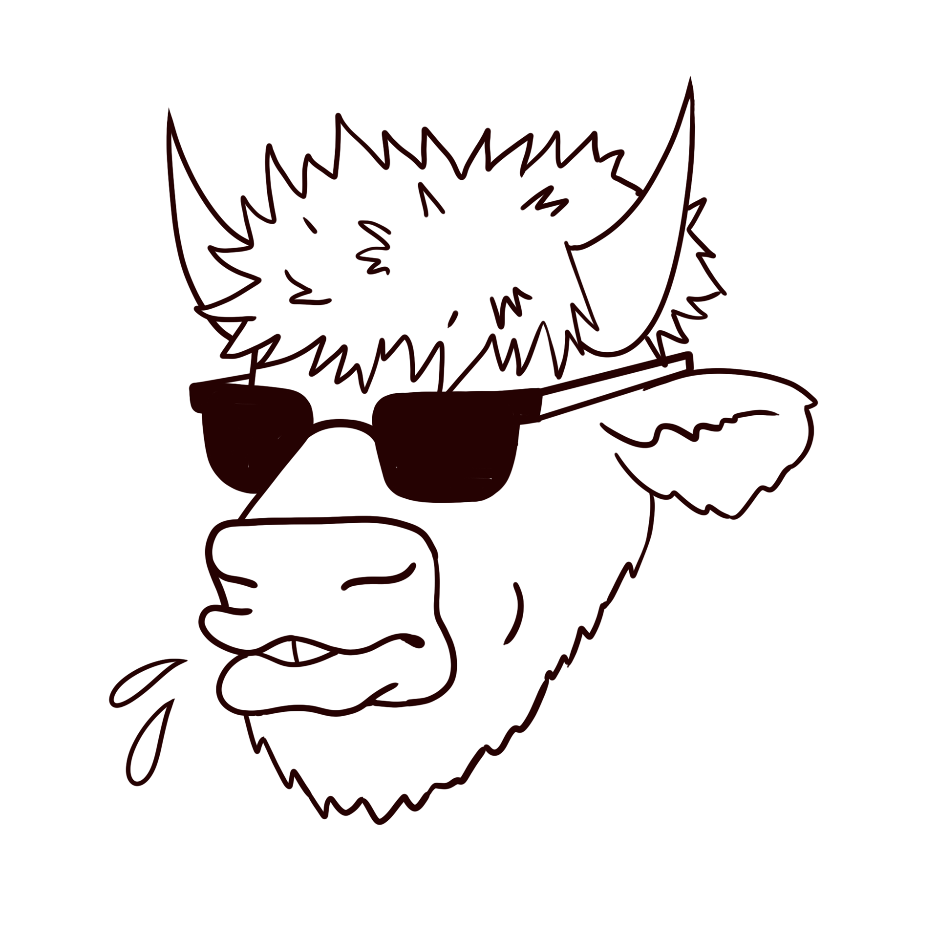
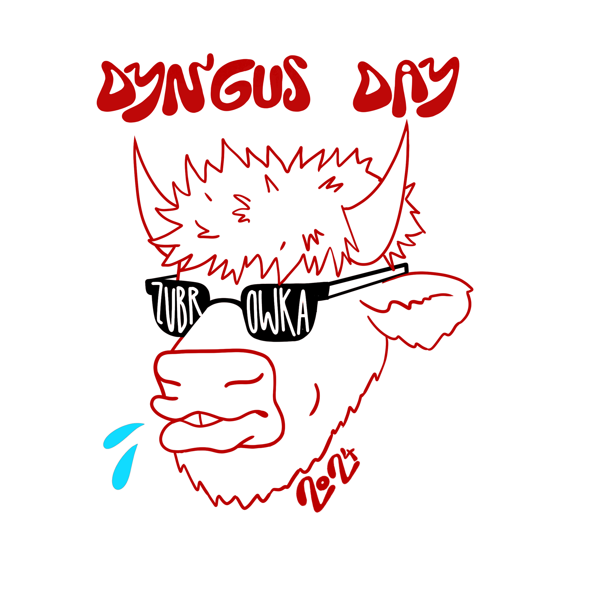
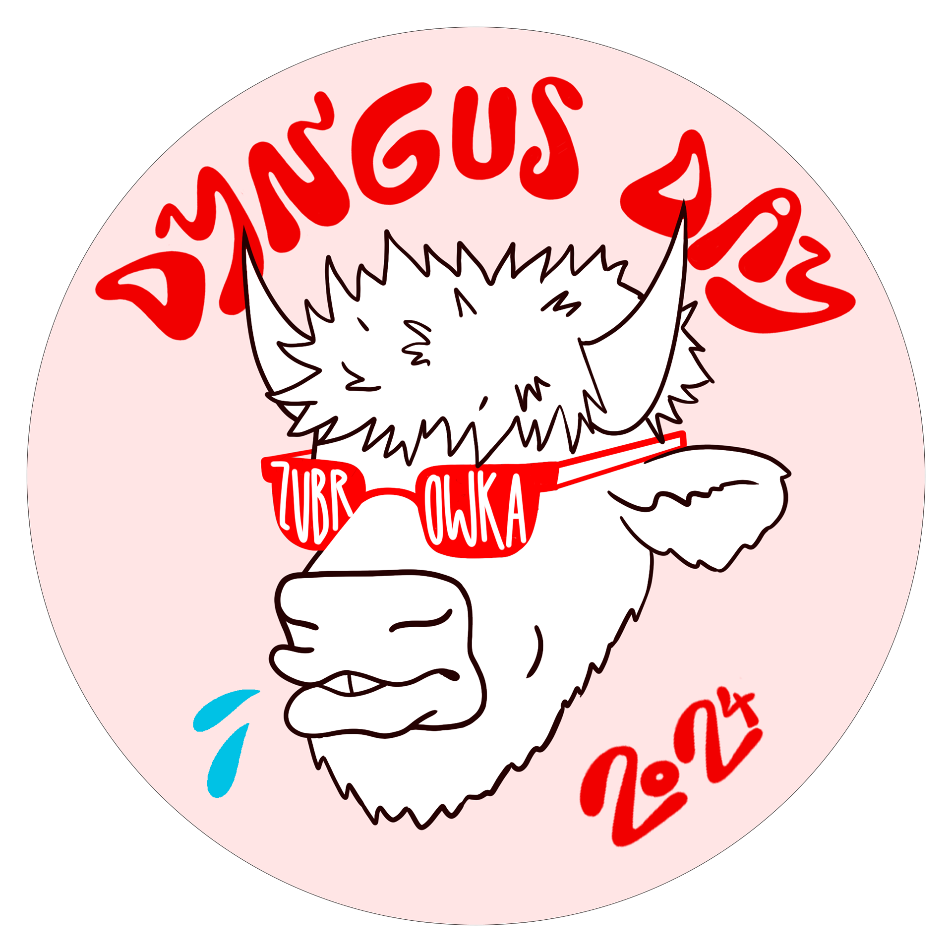
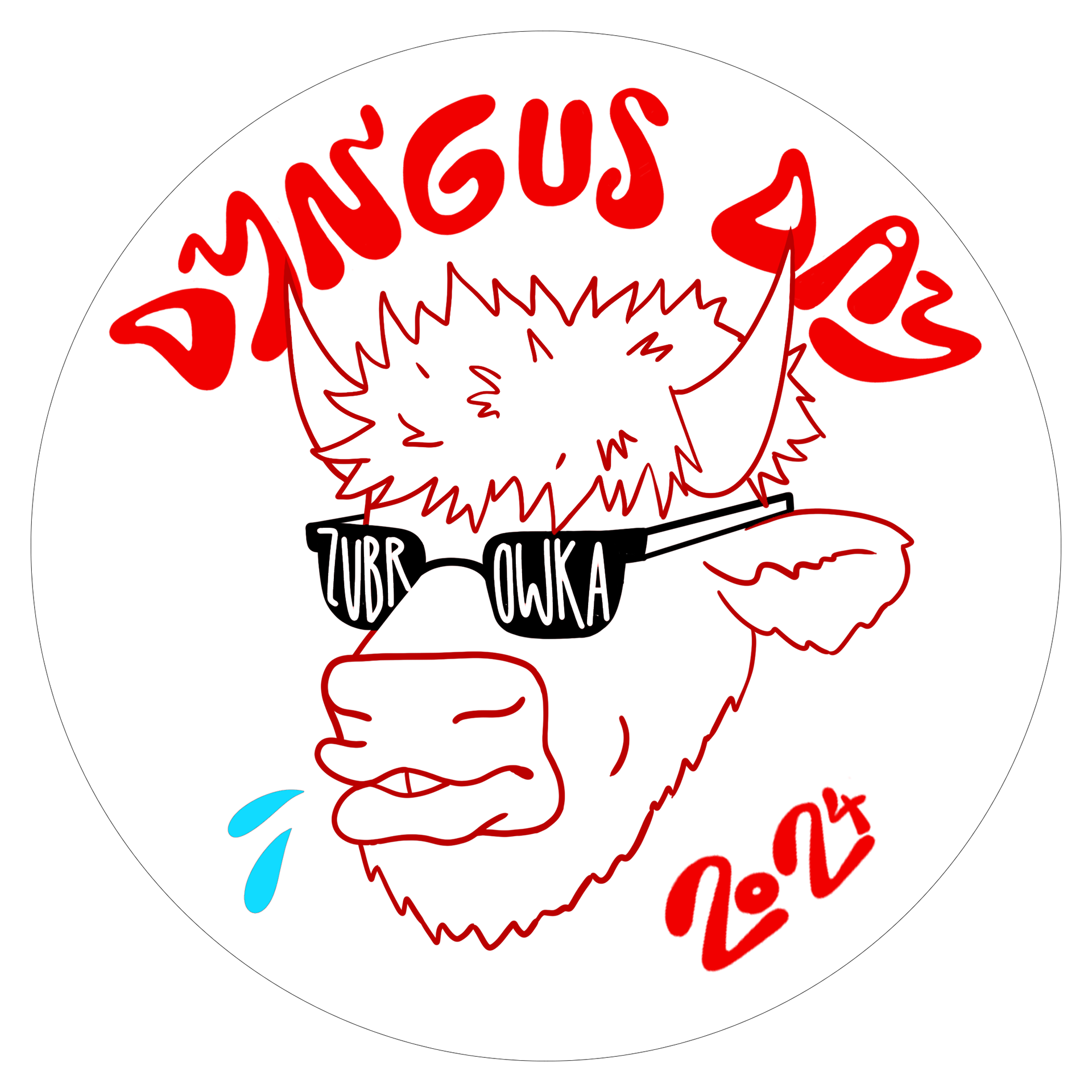
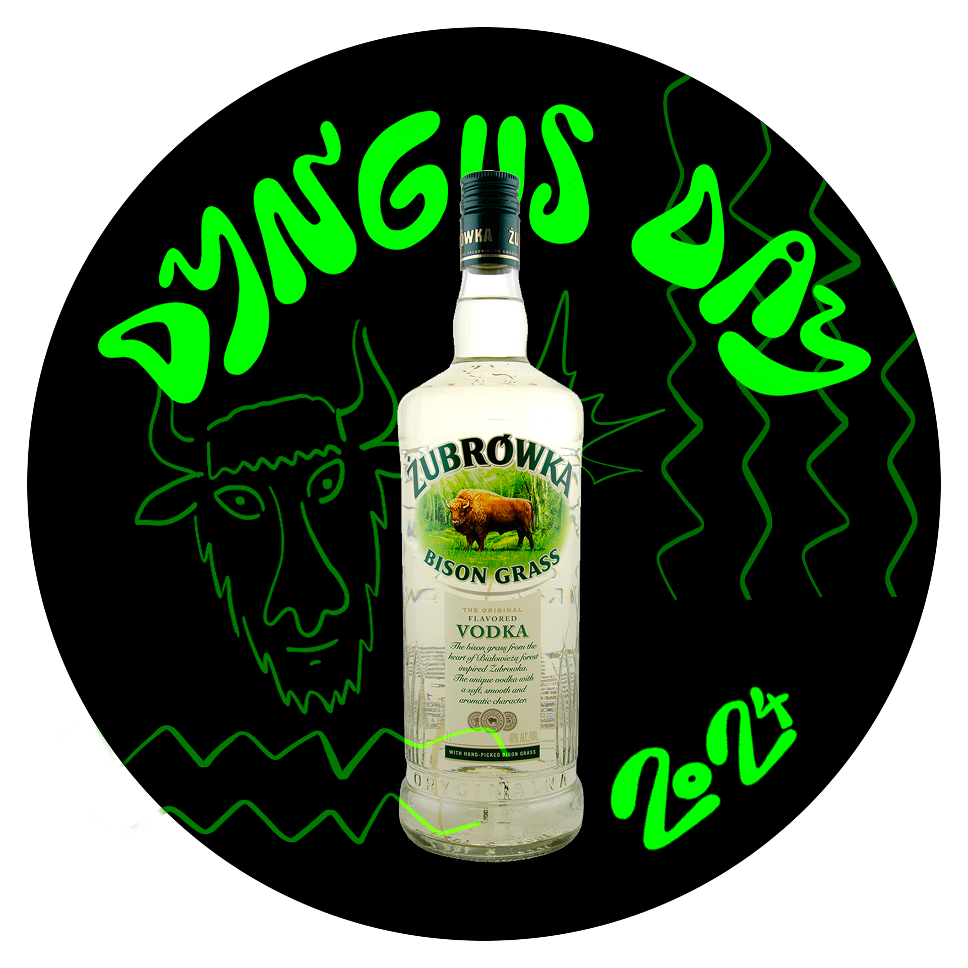
I explored various different iterations of stickers, unsure of which idea I liked most.
You can't sponsor a festival without some fun wearable merch. I was tasked with the job of creating some fun t-shirts that matched the theme of the festival while going wild with the brand's style.
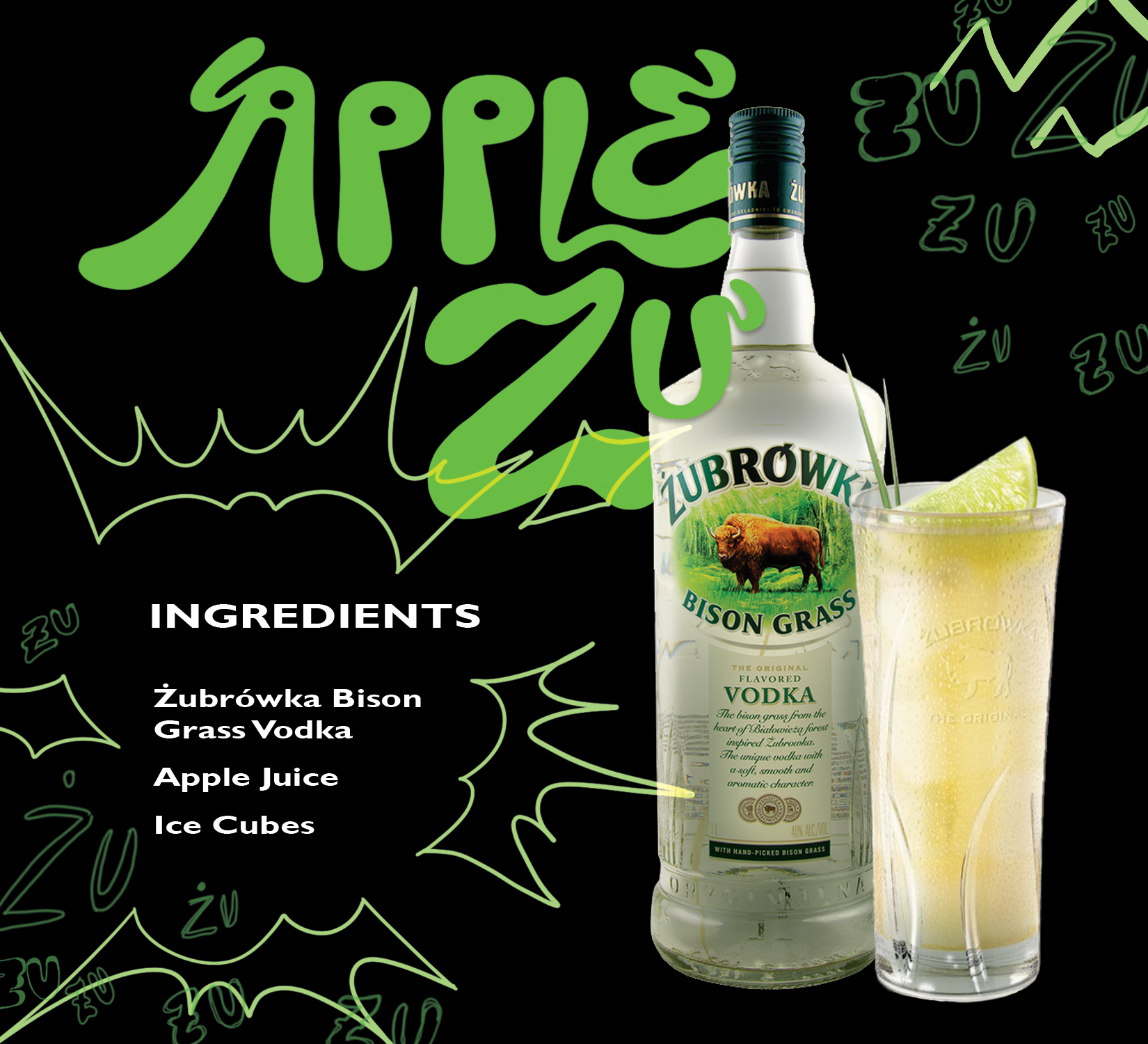
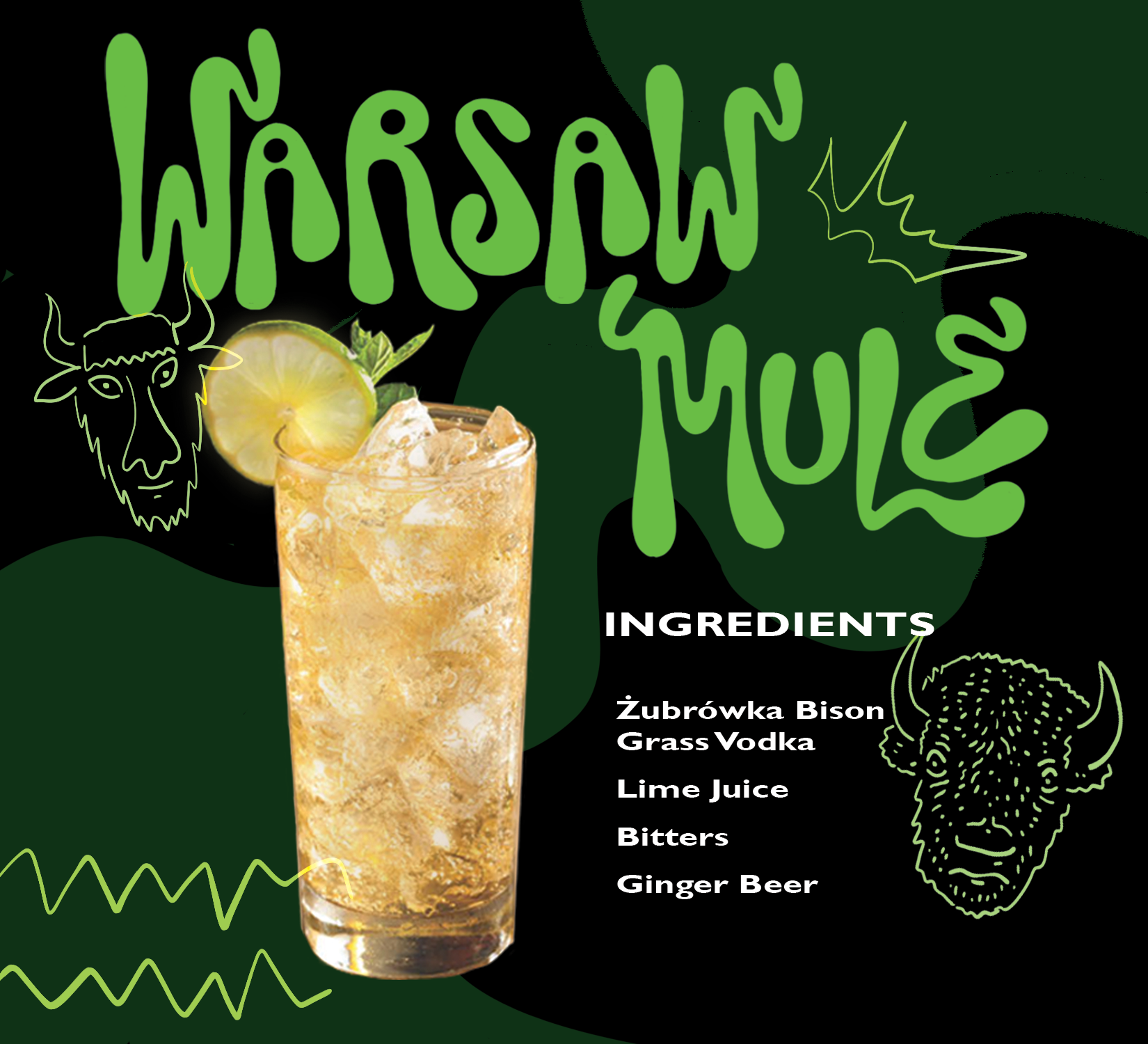
Recipe Cards (Post Brand Book)
These recipe cards were created to be distributed to the public during festival events to promote the different cocktails that can be made with Zubrowka Vodka.
As I like to say sometimes, I went wild with these recipe cards.
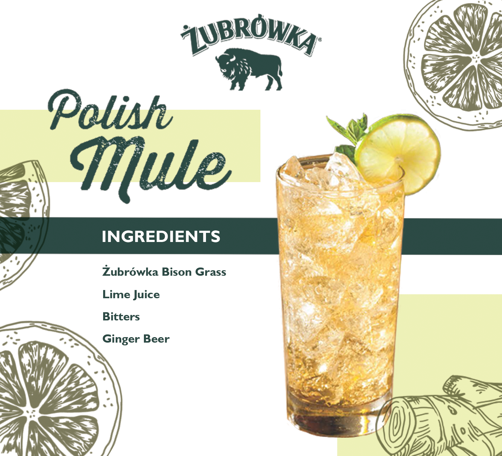
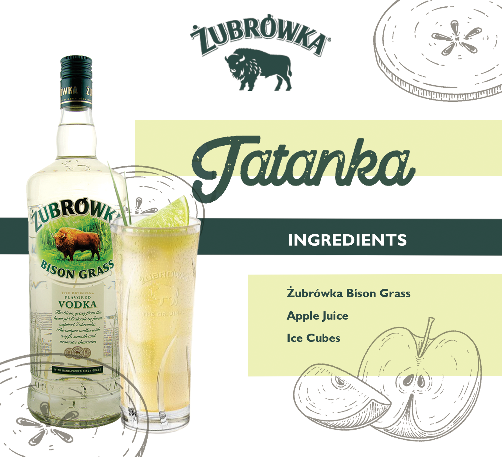
Recipe Cards (Pre-Brand Book)
The brand specifically asked for the cards to be in this style despite not matching the branding guidelines in the brand book.
Dyngus Day AD
The original Print AD for the Buffalo 2024 Dyngus Day festival that was rejected by the festival coordinators (this still boggles me, as the festival coordinators accepted some wacky designs and aren't even my client)
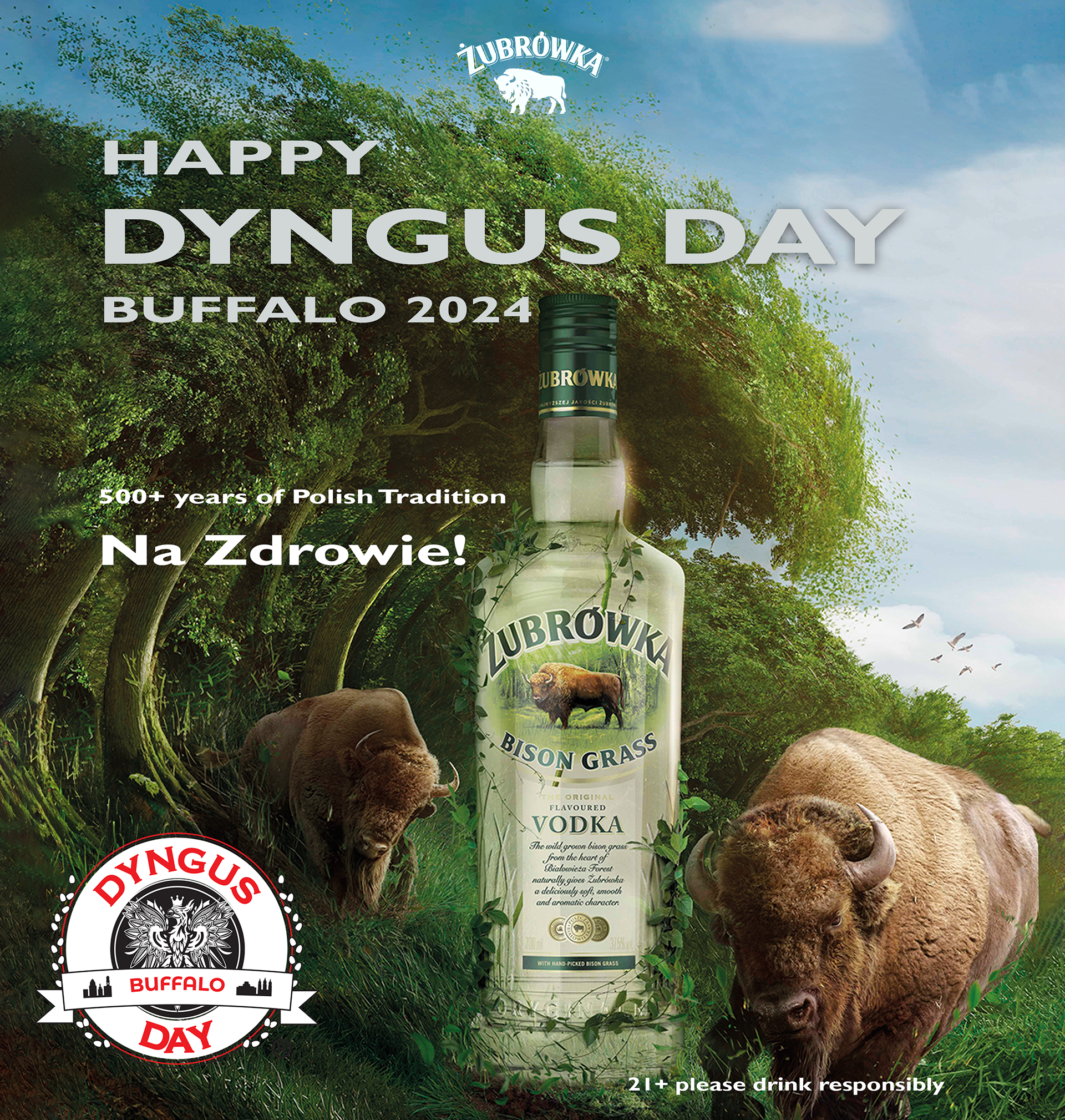
The Print AD that I had to put together last minute that was requested from the festival coordinators.
Sell Sheets
To the left is the final version of the sell sheet that was created for the brands launch at local stores. The final version includes motifs that are currently being used on their socials.
While creating this deliverable, I wanted to adhere to the brand's youthful nightlife vibe so I opted for a dark background and light text.
Below are some variations and old drafts of the sell sheet. I experimented around with composition until I was satisfied with the layout of the sell sheet.
I enjoyed putting the sell sheet together. It felt like a design puzzle, trying to fit everything into it's spot while adhering to the basic design principles.
Flyers
This flyer was created for the Taste of Polonia in Chicago. The Brand was doing a soft launch to get the word out that the beloved Polish Vodka would soon be hitting the stores in the United States.
For this, I wanted something simple and bold to highlight the fact that this vodka is perfect as is.
I started with some thumbnails to figure out placement of the flyer. I loved the spirited slogan, "Wild Side of Life," and wanted to incorporate that into the design. Ultimately, the final draft ended up fairly different from the original sketches, and the slogan was dropped because the sales team was worried it wouldn't translate well in the United States.
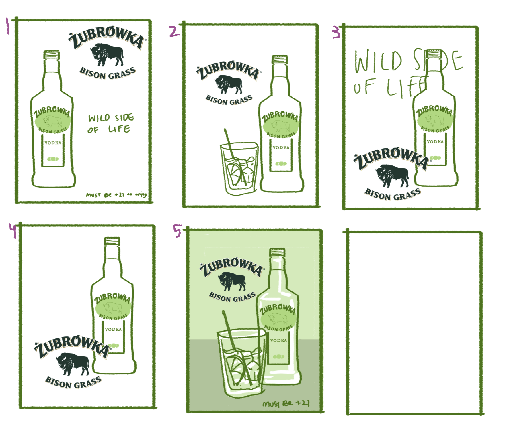
Quick Thumbnails